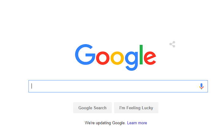
You may or may not have noticed that Google has changed their logo, you may or may not have noticed this, but it is now the sixth time that they are changed their logo up. But this time it is completely different to what has come before.
Why Change The Logo After 16-Years?
Well not too long ago, back in the days where the only way to access Google was to load up your desktop PC, whereas now you have Google at the tip of your fingers, if you’re like me, you use it without even knowing.
Whether it is Google Maps, Google News or Google+ many people use Google products on a day to day bases. Being accessible from your phone, TV and even your car dashboard, Google has evolved a lot in the past 17 years. And it’s about time their logo reflected that.
Tamar Yehoshua, VP, Product Management & Bobby Nath, Director of User Experience have said in a Google Blog
“Today we’re introducing a new logo and identity family that reflects this reality and shows you when the Google magic is working for you, even on the tiniest screens. As you’ll see, we’ve taken the Google logo and branding, which were originally built for a single desktop browser page, and updated them for a world of seamless computing across an endless number of devices and different kinds of inputs (such as tap, type and talk).”
As well as saying this they also said
“This isn’t the first time we’ve changed our look and it probably won’t be the last, but we think today’s update is a great reflection of all the ways Google works for you across Search, Maps, Gmail, Chrome and many others. We think we’ve taken the best of Google (simple, uncluttered, colorful, friendly), and recast it not just for the Google of today, but for the Google of the future.
You’ll see the new design roll out across our products soon. Hope you enjoy it!”
Here are some design ideas that didn’t make the cut Google Design Ideas